OFFENSIVE- DatA merge4/29/2020
for this process and production made with InDesigns' data merge feature. I picked tweets by @goodguyfitz, @TobyOnTheTele and @jshlatt. I used a simple colour sheme with a grey, white, and yellow. I wanted keep the lay out to use a main rectangle then offset from element from that. I wan't so confident with InDesign but when I started struggle I guess I had to teach myself and figure out it.
0 Comments
Physical Studio4/11/2020 1. given two words then we had to wright and draw the two words
2. typography 3. overprinting 4. type 5.book SaRA WoRKSHOP4/11/2020 3d from I Am Abstract on Vimeo.
A workshop designed to explore the use of z-space in After Effects. Using cameras, textures and composition effects, working with the third dimension, pre-composing effects and production builds in After Effects, and track mattes.
At the end of the workshop you will have a ten second movie Sara Workshop4/9/2020
A workshop exploring data, statistics, text and info-graphics on screen. During the workshop you will create a short data-visualisation piece, lasting 10 seconds. I will cover text presets, wipes and transitions, alpha channels and the use of solids and vectors
sara Workshop4/9/2020 eye from I Am Abstract on Vimeo.
EYE
In this workshop I will be exploring ways of working using hand-drawn images and digital production. Loops, footage and boils, stroke effects, colour effects, mattes and masking and text effects. Preparing photoshop images, image sequences and layers. Alex Workshop 3- BH4/9/2020
Barbra Hepworth
1) POSTER BRIEF Brief: Create an A3 Portrait Swiss style poster to promote a Barbra Hepworth exhibition. Research and familiarise yourself with the Swiss International Style. Design an A4 poster using all of the content provided, paying homage to the Swiss Typographic Style. You may use graphic elements suc h as lines and graphic shapes and you colour. Restrictions 1. Only use graphic shapes inspired by Hepwor th’s sculpture. 2. Use two colours (white is not a colour). 3. Only use Helvetica or Futura typeface and fonts. 4. Include the Arts Fund logo Think about 1. Use a design grid to organise your content. 2. Pay attention to type size and hierarchy. 4. Be playful, experiment! https://www.swissted.com/ Barbara Hepworth was born in Yorkshire in 1903. She lived in Cornwall since 1939 and has become principally associated with the art of St Ives and with the sea and landscape of that place. This exhibition presents her in a broader light and spans her whole career. Alex workshop 33/13/2020 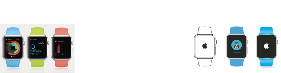 working on mock ups in illustrator you make a very visual thing in a few minutes, visualizing products and maybe the product that haven't been relisted and you only have drawning you quickily see what it looks like on the product. this we made a apple watch were there might be not may mocks and you want see if the design is that right ratio and fits that design of the product.
I might use this for quick visual reference and mock up some of my own visuals. Alex workshop 23/13/2020  Learning more about illustrator has been useful in my projects and in how I design in and out of university . learning quicker meteors and techniques. I.e. the pathfinder tool is so useful gives new and creative ways to design and create logos and shapes the way that can cut shapes out of shapes gives me ways to create something that i never thought of. then been able to cut out of text to make maybe a over used text in to something new and unique. with the clipping mask i can do things that I only could do in Photoshop and it opened my eyes to what I can do in illustrator. then you can warp and bend text that is very popular in logo and badge designs. it's good to learn this as if I have a client that wants that type of logo I know how to do it in illustrator.
Alex workshop3/13/2020
Leading is is the space between adjacent lines of type; the exact definition varies. In hand typesetting, leading is the thin strips of lead that were inserted between lines of type in the composing stick to increase the vertical distance between them.
To adjust the leading- Alt+down and Alt+up on the keyboard Kerning is is the process of adjusting the spacing between characters in a proportional font, usually to achieve a visually pleasing result. To adjust the kerning- click in between the Tyre, I.e. Ty[click]pe then Alt + left and Alt + right on the keyboard Tracking is (letter-spacing) adjusts spacing uniformly over a range of characters. To adjust the Tracking- highlight all the text then Alt + left/right on the keyboard Point size. any universal print point size is between 11-8pt any bigger it will seem to big when printed. and captions or quote the point size will range between 6-8pt easy to differentiate between body text. Layout is key, to draw out layout before doing is a good practice. I will be using drawn layouts in future as it is easy to map and visualize where elements will be placed, I can rearrange and take out add with drawings and if the layout is not working then i can redraw to make it to my liking. Thoery is pracite2/27/2020 Workshop 1
What really inspired me for this animation is a poet named Levi The Poet. he is Christian poet but different from a lot of others, unique. He in one of his works focus on a story, the title is correspondents. A poem, a song and an instrumental, I listened and read he’s poems and found internet in the commentary that fallowed correspondents. The explanation of the poems and its story was intuitive, he explains that the poems would focus on a theme and picked three words girl and a boy and a treehouse. Theses three words would be base of the poems what is interesting though is that even though the poet has focus on these quintessential themes the writing takes journeys and mystery and thought into another element. "Correspondence (a fiction) is a series of letters written from a girl, a boy, and a father to one another, to their journals, and to God.” This element of letters and journals and it might never say that they are writing to god by they differently writing about someone more powerful, a saviour or someone that would forgive. This is a god like figure and when reading you don’t immediately thing of god, but you do have a naïve of people wanting and longing for faith or holding to a faith throughout the poems. Another thing that Levi story’s is that he involves himself into the work, artist like to do this all the time is make a piece of work and put a little bit of themselves into the work. Levi does this in a way that is apparent as poignancy and meaningful, describing his own mental health and also, he’s fathers mental health, he’s father sadly suicided due to his mental health. “The essence of the story is that the boy and girl (ageless, nameless) are in love, but the girl's father, a whaler, takes her away and out to sea on a voyage to catch this whale - like a Moby Dick sort of thing.”
Workshop 2
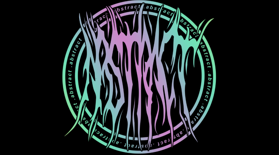
This project was to rebrand my own branding and logo. Create imagery that is personal to myself, changing branding to suit my passion in music. There was a personal indecisiveness with colour and images. Figured out what is my brand statement. The outcome had a contrast in design style but still has modern, musical, and colourful logo. The abstract project was a brief that tasked myself rebranded of self and my design brand. This would require me to create imagery and symbolise my identity, including personality in the brand, make it more accompanying to suit a musician. Creating an artist feel and breaking design norms but then still indulging modern design in clothing and music. Researching text, images, shapes and design involved in music, examining album covers, music videos and social media. Pin pointing ideas that court my eye. There was personal indecisiveness with colours and the symbolise that would portray my brand, a creative justice of having too much creativity. Also trying to figure out my brand statement, the brand that audience would see and the brand I see, may perhaps in fact be completely differ. Needing make decisions faster as I would spend to much time worrying about the concepts behind the brief then actually completing it The outcome was a contrast of design and ideas, ideals that would connect in style and design. A clashing of mind and modern design, with a logo that has a “deathcore” or “heavy metal” undertones with the typeface. Contrasting that is the modern aspects with Japanese text, and colour with use of pastels and colour that have lower saturation. the Japanese text translates to abstract, a name that I gave myself, it has come from a fondness of abstract art, and abstracted images, the concept and the way that I design and create this may be why there’s in my outcome a juxtaposition of images and colour make a unique and different design. The Japanese wording is become more popular in western design, may be the grove of fashion and design in fashion, amine and manga is becoming more popular as it is becoming more available, more of a norm to watch anime. Workshop 3
fallow me from I Am Abstract on Vimeo.
“Minimalism” this says so mush but so little. The mean of minimal is “Characterized by the use of simple or structures, especially geometric or massive ones” the word ‘simple’ stands out to me because it describes the type of graphic work that I do.line, angle and geometry this is my favourite type of graphics because the line and the nothingness and clean, speaks to my perfectionism, basically I want everything in line, everything in
certain place. I created was mainly visible not physical, but this form could be created in to physical media as well this was inspired by a song called Fallow me in to the dark by fightstar, a post punk and heavy metal band in the 2000s. they had a unique way of music and made orchestral with rock and punk, the song fallow me in to the darkness has lyrics inspired by blade runner. and songs named after themes in blade runner. Batty is a machine built for war, so when he speaks of attack ships on fire, I assume he recalls the origins of his battle scars. This suggests to me that the Tannhäuser gate may have been a location of a pivotal battle, and that C-beams may be some terrifying weapon or other. this concept of the move. fightstar quote blade runner in one of their varies "I watched C-beams glitter in the dark near the Tannhäuser gate . All those moments will be lost in time, like tears in rain. Time to die" and then in their song saying "Days spent in the rain. Some people say it's a shame that we Only get to live once But if you'd seen the things that I've seen." Workshop 4traingle from I Am Abstract on Vimeo.
A graphic processing system for representing three-di mensional objects on a monitor which uses a pipeline of polygon processors coupled in series. The three-dimen sional objects are converted into a group of two-dimen sional polygons. These polygons are then sorted to put them in scan line order, with each polygon having its position determined by the first scan line on which it appears. Before each scan line is processed, the descrip tions of the polygons beginning on that scan line are sent into a pipeline of polygon processors. Each poly gon processor accepts one of the polygon descriptions and stores it for comparison to the pixels of that scan line which are subsequently sent along the polygon processor pipeline. For each new scan line, polygons which are no longer covered are eliminated and new polygons are entered into the pipe
For each new scan line, polygons which are no longer covered are eliminated and new polygons are entered into the pipe. After each scan line is processed, the pixels can be sent directly to the CRT or can be stored in a frame buffer for later accessing. Two polygon processor pipelines can be arranged in parallel to process two halves of a display screen, with one pipeline being loaded while the other is processing. A frame buffer and frame buffer controller are provided for overflow conditions where two passes through the polygon pipeline are needed. A unique clipping algo rithm forms a guardband space around a viewing space and clips only polygons intersecting both shells. Extra areas processed are simply not displayed. The present invention relates to processing systems for three-dimensional graphics displays Three-dimensional computer graphics displays are used to display images to a user as if he were observing a real-world environment. These systems store in a data base a representation in three-dimensional coordinates of three-dimensional objects, as well as their color and other properties. Additional "environment' informa tion including the number, color, location, and other properties of illumination sources, atmospheric proper ties, and many other details may also be specified. The display is produced after being provided with the de sired viewing angle for the viewer. The system must calculate all the details of the image, including deter mining which objects obscure others from the viewer's point of view, and present them accordingly. point of view, and present them accordingly. A typical graphics display system is shown in FIG. An image database 12 stores a description of the objects in the scene. The objects are described with a number of small polygons which cover the surface of the object in the same manner that a number of small tiles can cover a wall or other surface. Each polygon is described as a list of vertex coordinates (X, Y, Z in "Model” coordi nates) and some specification of material surface prop erties (i.e., color, texture, shininess, etc.), as well as possibly the normal vectors to the surface at each ver tex. For three-dimensional objects with complex curved surfaces, the polygons in general must be triangles or quadralaterals, and the latter can always be decom posed into pairs of triangles. Workshop 5tree from I Am Abstract on Vimeo.
"Where my love, does the beauty inside of a tree reside, made up of atoms, identical and colorless, where the light of the sun merely vibrates in waves toward our eyes, striking tissues and moving along nerves like a telephone wire, to their endings, like telephones? I do not know. There is no actual color in the atoms of which the tree is composed, or in those vibrations. Shape, size, color, touch and the like are simply the names we call our sensations, and no amount of study can ever bring the notion of beauty to the tree"- Levi the Peot quotation of , Clyde Kilby’s quotation of C.S. Lewis. as he regards a tree, and where its beauty comes from
|
||
