Alex workshop 33/13/2020 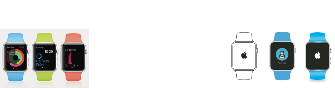 working on mock ups in illustrator you make a very visual thing in a few minutes, visualizing products and maybe the product that haven't been relisted and you only have drawning you quickily see what it looks like on the product. this we made a apple watch were there might be not may mocks and you want see if the design is that right ratio and fits that design of the product.
I might use this for quick visual reference and mock up some of my own visuals.
0 Comments
Alex workshop 23/13/2020 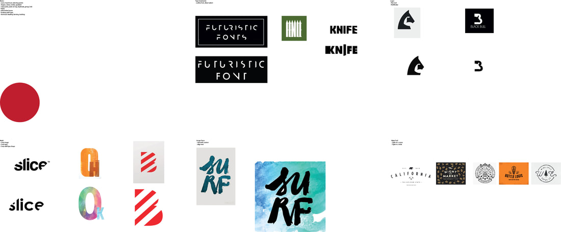 Learning more about illustrator has been useful in my projects and in how I design in and out of university . learning quicker meteors and techniques. I.e. the pathfinder tool is so useful gives new and creative ways to design and create logos and shapes the way that can cut shapes out of shapes gives me ways to create something that i never thought of. then been able to cut out of text to make maybe a over used text in to something new and unique. with the clipping mask i can do things that I only could do in Photoshop and it opened my eyes to what I can do in illustrator. then you can warp and bend text that is very popular in logo and badge designs. it's good to learn this as if I have a client that wants that type of logo I know how to do it in illustrator.
Alex workshop3/13/2020
Leading is is the space between adjacent lines of type; the exact definition varies. In hand typesetting, leading is the thin strips of lead that were inserted between lines of type in the composing stick to increase the vertical distance between them.
To adjust the leading- Alt+down and Alt+up on the keyboard Kerning is is the process of adjusting the spacing between characters in a proportional font, usually to achieve a visually pleasing result. To adjust the kerning- click in between the Tyre, I.e. Ty[click]pe then Alt + left and Alt + right on the keyboard Tracking is (letter-spacing) adjusts spacing uniformly over a range of characters. To adjust the Tracking- highlight all the text then Alt + left/right on the keyboard Point size. any universal print point size is between 11-8pt any bigger it will seem to big when printed. and captions or quote the point size will range between 6-8pt easy to differentiate between body text. Layout is key, to draw out layout before doing is a good practice. I will be using drawn layouts in future as it is easy to map and visualize where elements will be placed, I can rearrange and take out add with drawings and if the layout is not working then i can redraw to make it to my liking. |
